While we were in Stockholm we stopped into the independent Gallerie Kontrast to see the Sarah Moon exhibition
The more I look at photography as art, the more I realise it seems all you have to do is shoot out of focus & chat it up afterwards.
Call me cynical, perhaps…
But someone did once say to me that amateurs worry about sharpness in their photography, while pros worry about light. I guess that’s true. But deliberately or otherwise, the ‘photographic artists’ appear to go out of their way to leave their image a blue.
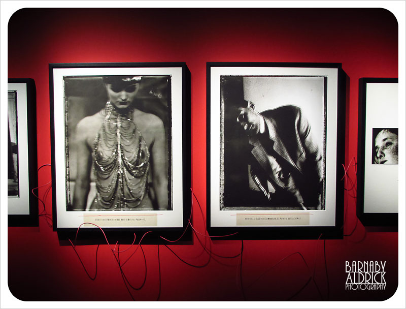
The two images above of Sarah Moon’s, of a circus chick and some contrasty dude were my faves of her collection, and although they were way out of focus, they definitely had a dreamy, painterly quality to them. From documentaries I’ve since seen on this eccentric French photographer, it’s hard to know if the out of focus thing is deliberate, or because she’s not really cared to master the science.
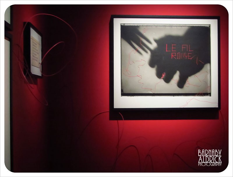
But the thing I liked most about this part of her exhibition (Le Fil Rouge) was the presentation.
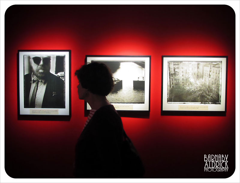
Sumptuously spotlit red walls, with black box-frames standing in contrast to the white bordered prints showing those fun film fringes.
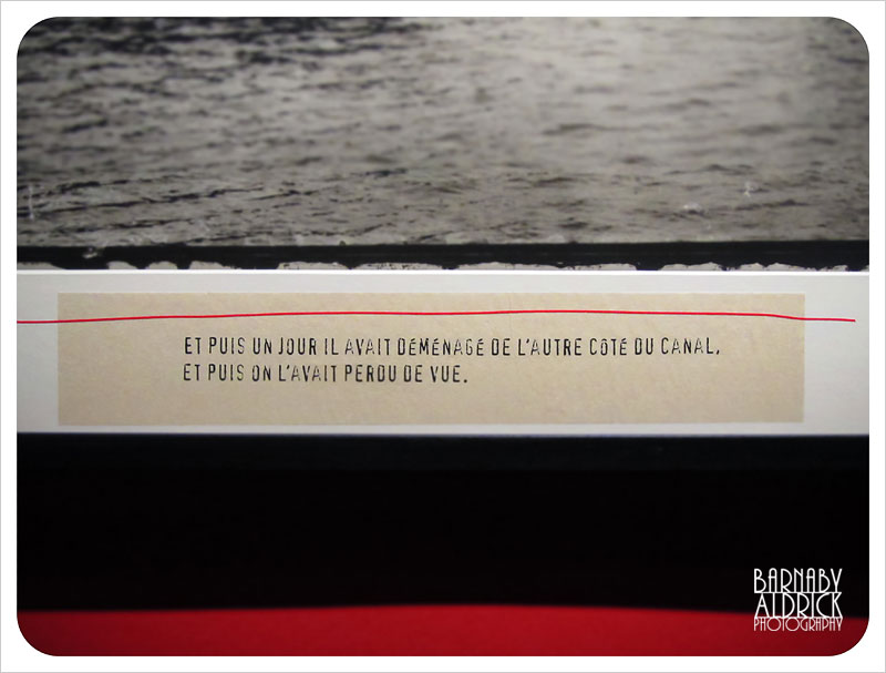
I loved how she’d printed the descriptions in a dodgy type-writer font, with a piece of red-wire under the glass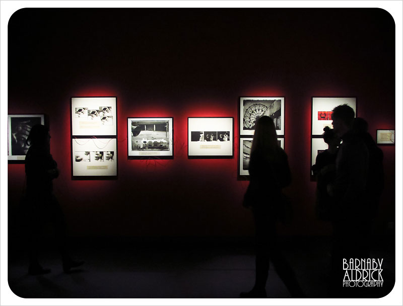
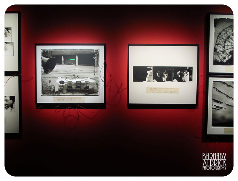
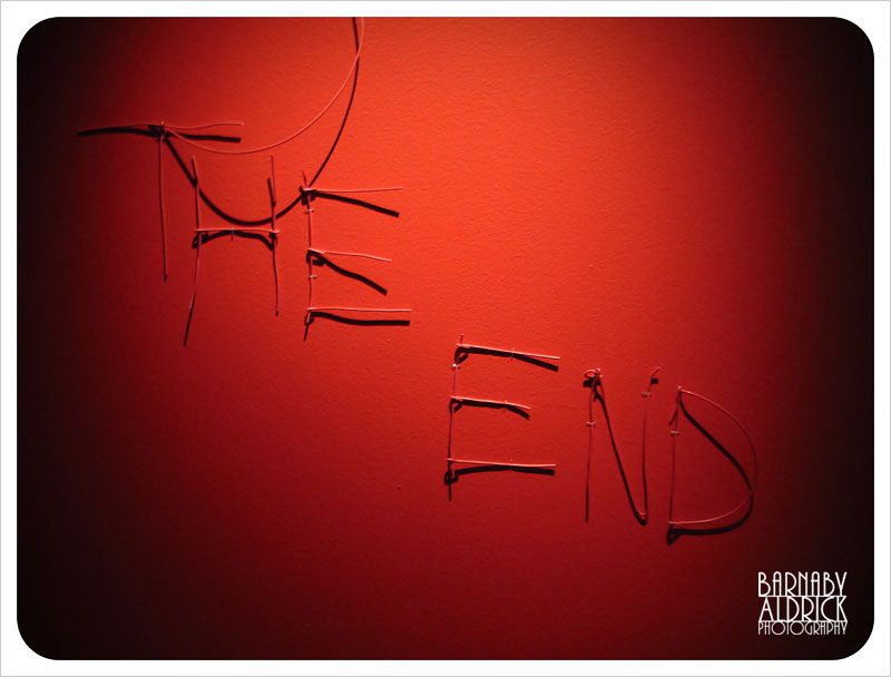
I also liked how she’d run strips of wavy red wire between and behind each image, no doubt as a visual metaphor of some sort.
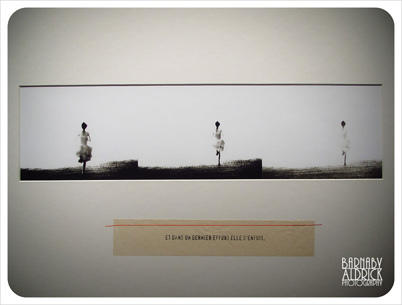
This was another of the images I really liked, of a girl running out of shade into an overexposed horizon.
It’s all about presentation, kids.
Very cool.