A couple of weekends back I went out to snap the pre-wed of a couple who’s wedding I’m very much looking forward to this summer.
They’re throwing the majority of their wedding in a marquee in the grounds of at Alice’s parents place out near Wetherby.
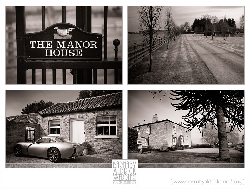
Check out the manor house…
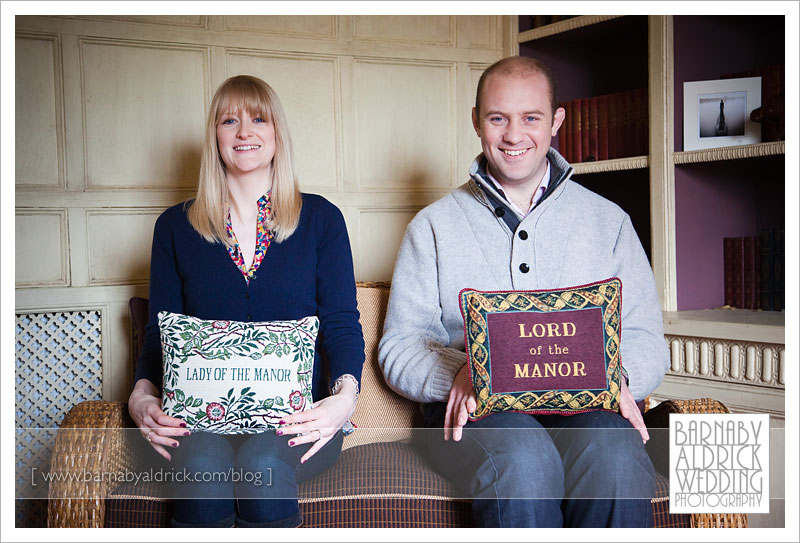
…and the lady & lord of the manor! You’ll see that these two rule and we’re so easy to photograph.
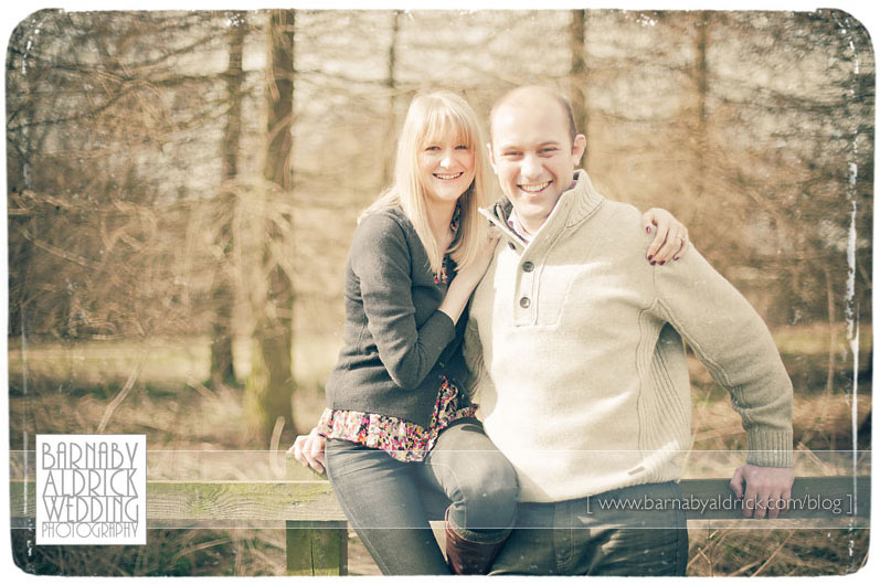
You may notice that in this and a few recent posts I’ve ‘processed’ my images to look washed out and a bit 70s. Well recently I’ve found a few spare mins to research and update my Adobe Lightroom presets. I’ve had a good shop around, mainly testing out the latest contributions of action hero’s Kevin Kubota & Totally Rad. One thing I’ve noticed from both is that their recent sets (especially the excellent Totally Rad ones showing examples here) is that they’re really starting to nail that vintage, old 70’s photo look. I’m a fan of the cross processed look, but have often turned my nose up at the photoshop actions that try to emulate SX70 film & faded photographs. However, there are loads of presets (such as Totally Rad’s Boogie Nights, Bitchin’ Camero & Crystal Ship) that essentially wash out your photo and make it look like it’s been sat in the sun for 30 years. This look can actually really bring a seemingly flat photo to life. Couple this with a cheeky bit of Photoshop texturing (dropping a textured image over the top, eg a rough canvas texture etc) & a sloppy border (which edges the image like an old film-enlarged development) & you can get some impactful (if slightly gimmicky) images.
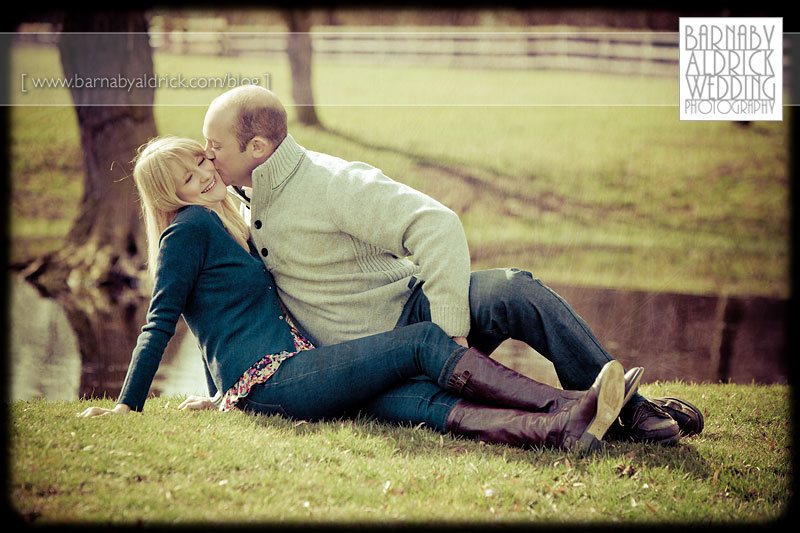
This image has a scratchy texture on it (most obvious around the lake) and I’ve forced the ‘post-crop border’ to make it look burnt out.
Possibly not my fave border effect, but it’s a bit different and would probably look more dramatic were this blog’s background black.
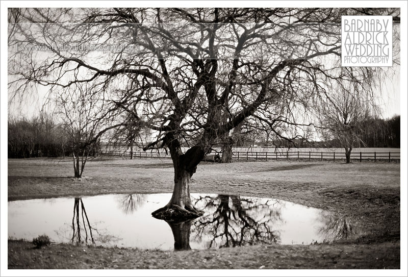
This beautiful old willow was wallowing in the grounds.
It’s around here they’re going to put their marquee on the big day and when evening comes these trees will shine with fairy lights!
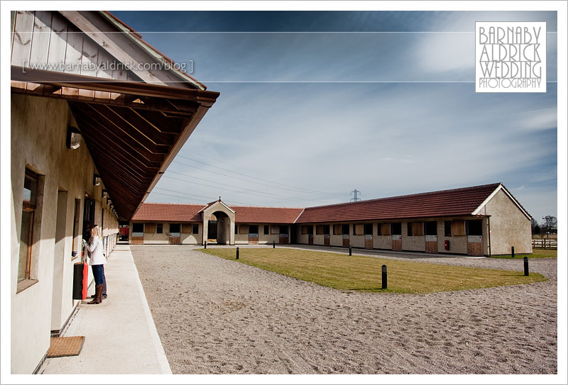
Here are the padocks where they keep their 16 racehorses!
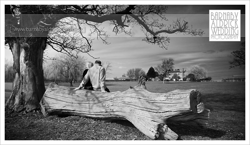
A reflective moment plotting marquee location.
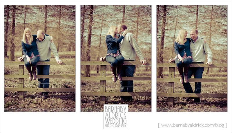
I rather like this f1.6 sequence. They found their public kissing display rather amusing.
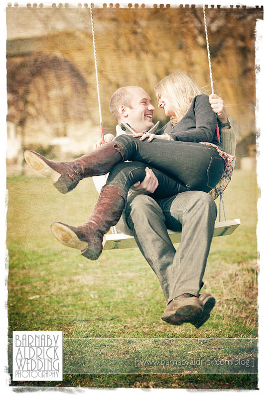
Here’s another faded, textured & bordered combo. Should I rename it ‘Swinging 60s?’
Perhaps not. Oh dear. Moving on.
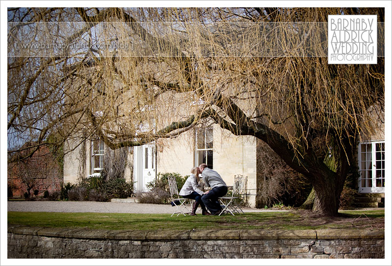
Alice told me she loves ‘Pride & Prejudice’ & is theming things that way, so they thought they’d take tea under the willow.
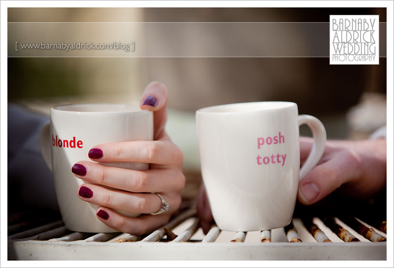
Telling cups!
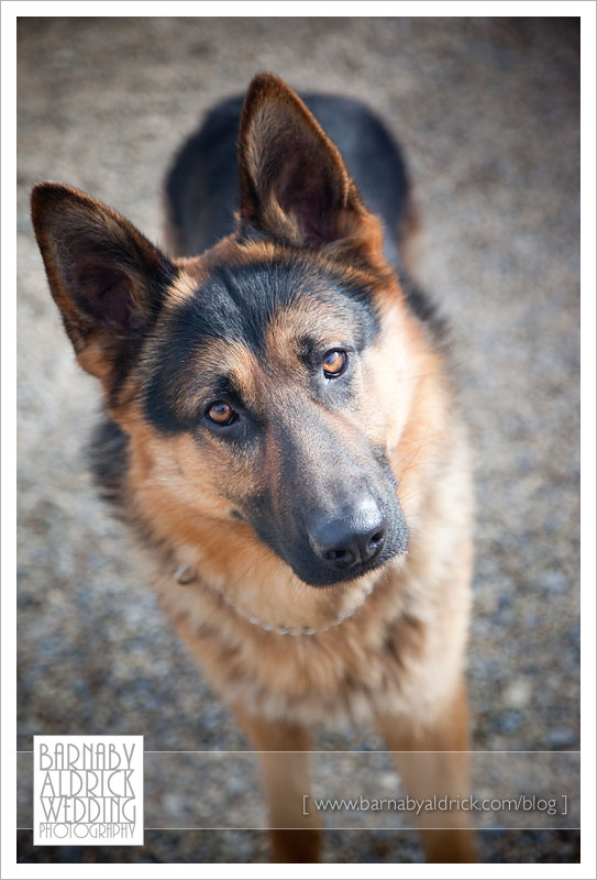
This chap was bolting around everywhere too. Super friendly; but one of those clumsy young dogs who hasn’t entirely got used to how big he’s got!
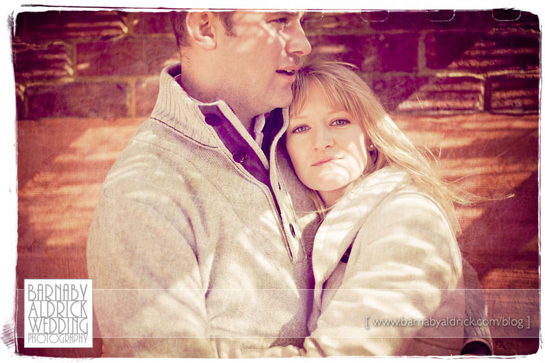
I quite like the redness of this one.
I like the image too. It was really windy and Alice’s hair kept getting blown around, so we found a sheltered corner by the outdoor pool!
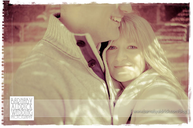
Or how’s a bout this one? I try to keep the wedding images I supply to clients reasonably timeless, with punchy colour, B&W or sepia toning, so that they won’t date too badly. I’m sure those 90s wedding couples aren’t looking back too fondly at the spot-coloured, soft-oval-bordered images they so liked back then…
But for these pre-wed snaps I thought I’d play about a little. The problem with these is that it becomes more about taste.
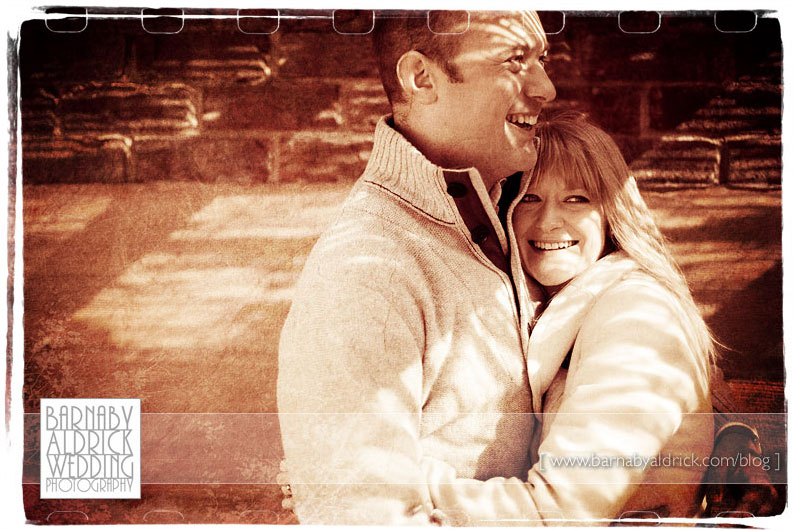
Here’s one with a heavier texture, a 35mm film edge and a bit of grain too. All three images are similar, but with quite different processing.
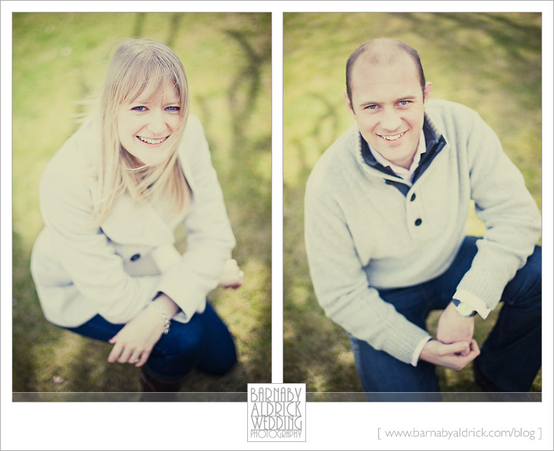
The classic 50mm everyone-looks-great-when-they-kneel image! Don’t they look ace.
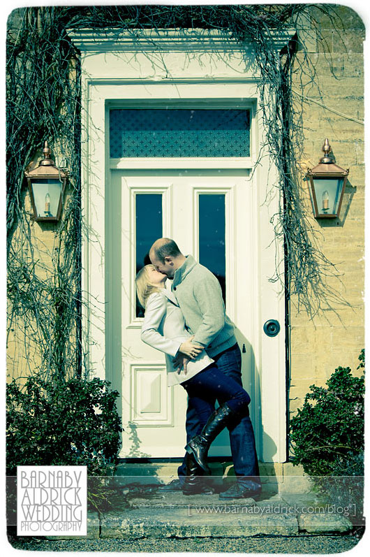
And finally, finishing off with a bit of passion in cross-processed fashion!
Great work Alice & Andy! I can’t wait for their big day.
